Exploring Market Structure - Story Telling by Claude Code
Imagine, you’re tasked with analyzing market structure of India’s industry sectors. Examining market structures across India’s key industries, fascinating patterns may emerge that can tell stories of competition, dominance, and opportunity. A deep dive into sectors like automobile, banking, and pharmaceutical sectors may reveas how differently these industries are structured—and what it means for investors and consumers alike.
This is exactly the problem solved using AI Agent architecture. What emerged was more than just a time-saver: it’s a reproducible, scalable system that transforms raw CSV data into interactive, multi-industry dashboards in hours, not weeks.
The breakthrough came from asking: “What if we designed this like an assembly line?”
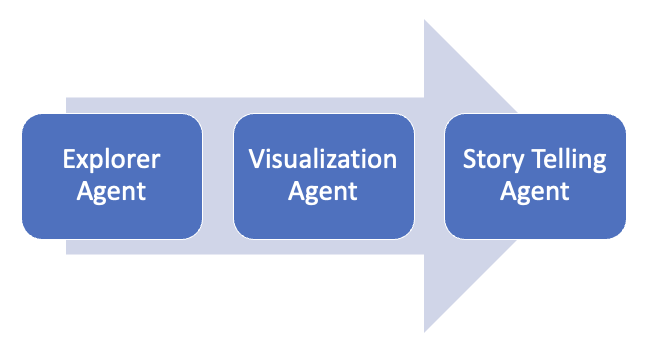
Agent Architecture: Specialists Agents Working in Harmony
In real world, you don’t have one person who gathers data, creates infographics, AND writes the story. You have specialists: a researcher who digs into the data, a graphics editor who creates visualizations, and a writer who crafts the narrative. Each excels at their craft, and they hand off work to each other in well-defined formats.
You drop in a CSV file at one end, and out comes a complete dashboard for analysts at the other:
That’s exactly how three specialized agents are designed with each agent as a master of one domain and communicating with other agents through clean interfaces.
Once set up, analyzing a new industry is literally became one command. The system handles everything from data cleaning to dashboard creation. A unified dashboard where you select any industry from a dropdown—Automobile, Banking, IT Software, Pharmaceuticals—and instantly see comprehensive market analysis: Who are the giants? Who’s profitable? How concentrated is the market?
All interactive, all exportable, all automatically generated from these agent architecture is presented below.
The data used in this dashboard is quarterly data from Apr-Jun, 2025.
Using Claude Code Agent Framework
We used Claude Code, which is a command line tool allowing to delegate complex coding tasks to Claude. Claude Code acted as an intelligent coding partner that understood the requirements and created this project end to end.
Let’s dive deeper into how these three agents are created.
1. Explorer Agent
Transform messy, real-world CSV files into pristine, analysis-ready datasets.
Think of this agent as your data detective. It receives a CSV file that might have missing values, weird outliers (one company showed 92,000% growth—clearly a data error), and inconsistent formatting. Its job is to make sense of the chaos.
Explorer Agent instructions in markdown:
---
name: data-explorer
description: Loads and explores datasets. Assesses data quality, creates clean subsets, calculates derived metrics, and prepares analysis plans.
---

## Role

Transform raw CSV data into analysis-ready datasets with comprehensive documentation.

## Input
- CSV files from `./data/` (columns: Name, Market Capitalization, Sales, Profit, etc.)
- Analysis question or insight goal

## Output Location
./out/insights/[insight-name]/plan/

Create the following set of files.

- ./out/insights/[insight-name]/plan/data/ - Clean CSV files
- ./out/insights/[insight-name]/plan/analysis-plan.md - Details of the data files create along with their metadata.

## Workflow

1. Load & Inspect - Parse CSV, examine structure, identify issues
2. Clean & Transform - Handle missing values, calculate derived metrics, if required
3. Create Subsets - Generate focused datasets for the required visualizations
4. Document - Write analysis-plan.md, data-dictionary.md, exploration-notes.md
5. Verify - Check data sufficiency and completeness
An example dataset shown below.
2. The Visualization Agent
Transform clean data into interactive, publication-ready visualizations.
This agent is your graphics department. It receives the cleaned datasets and analysis plan from the Data Explorer and thinks: “How do I show market dominance? A treemap where bigger rectangles = bigger companies. How do I show profitability patterns? Color code by profit margin—green for profitable, red for losses.”
The genius of separation: Each chart lives in its own folder with chart.js (the D3 code), styles.css (all the visual styling), and example.html (a working demo). Why separate? So you can embed these charts in reports, websites, or presentations without modification. Just copy the folder.
Visualzation Agent instructions in markdown:
---
name: chart-builder
description: You are the Create Charts agent, a D3.js visualization specialist. You transform prepared datasets into beautiful, interactive charts with proper code organization and comprehensive documentation..
---

## Role

Transform prepared datasets into production-ready, interactive D3.js visualizations.

## Input
- ./out/insights/[insight-name]/plan/data/ - Clean CSV files
- ./out/insights/[insight-name]/plan/analysis-plan.md - Medata and guidance of the data files.

## Output Location
./out/insights/[insight-name]/charts/

## Workflow
- Read `analysis-plan.md` to understand the insight question
- Review recommended visualizations
- Check the data dictionary for field details
- Choose appropriate chart types (bar, line, scatter, heatmap, etc.)
- Design for clarity and insight delivery
- Plan interactions (hover, click, zoom, filter)
- Consider responsive design
- For multiple related views, plan navigation (dropdown, tabs, menu)

## File Structure for charts creation

[chart-name]/
├── chart.js          # D3 visualization logic
├── styles.css        # Chart-specific styling
├── example.html      # Standalone demo
├── embedding-guide.md # Integration docs
└── data/             # Copy of required CSV

## Dashboard Requirements

- dashboard.html - Multi-chart container with tabs
- dashboard.js - View switching, industry selector, stats calculation
- dashboard.css - Layout and theme
- industries-config.json - Multi-industry configuration
- README.md - Overview and quick start
3. The Storytelling Agent
Turn charts and numbers into insights humans actually care about.
Here’s the thing: charts are great, but most people don’t want to stare at treemaps and scatter plots. They want answers to questions like “Who’s winning?” and “What does this mean for the industry?”
That’s where the Insight Writer comes in. It’s your analyst-turned-writer who examines all the visualizations and data, then crafts a narrative that makes sense of it all.
The agent follows a proven narrative structure. This is a sample of blog writer subagent created. The original one is not provided keeping in mind the lenght of the blog. The reader can be very creative and extend this sample provided and encouraged to implement their own.
Story-telling Agent instructions in markdown:
---
name: story-teller
description: Crafts data-driven narratives under 500 words.
---

## Story Structure (every blog post follows this)
Hook (50-75 words) - Grab attention with a question or surprising stat
Context (75-100 words) - Set the stage, explain the industry landscape
Core Finding (150-200 words) - The meat—specific insights with numbers
Closing (25-50 words) - "So what?" Why should anyone care?

## Quality Standards
- Under 500 words (respect the reader's time)
- Specific numbers, not vague claims
- Interpret patterns, don't just describe them
- No unexplained jargon
The output: A complete story package in ./story/blog-post.md plus bite-sized versions for social media in social-posts.md. Ready to publish, no editing needed (though you always can).
Claude Code Command: Bringing Agents Together
Remember that overwhelming feeling of analyzing 20 industries? Here’s where it all comes together. All three agents—Data Explorer, Chart Builder, Blog Writer—orchestrate through a single claude command agent:
Here is the analyze-industry command instructions in markdown:
---
description: Analyze industry structure dynamics — concentrated markets or fragmented market. Looks at market capitalization, sales and profits of players in a specific industry.
---

## Context
Market capitalizatin, sales and profits patterns in $1 industry. Data is available for key players in the industry is available in $2 data file.

## Your task
1. Use data-explore subagent to understand data elements required
2. Use chart-builder subagent to visualize market structure using tree map. Create different charts for market capitalization, sales and profits different perspectives. Also create a scatter plot for finding relationship between two metrics with third one as hue. Users should be able to select the metrics to create the scatter plot as desired.
    a. Add the following footer highlights for market cap
        - Total Market cap
        - HHI index Herfindahl–Hirschman Index (HHI) by market capitalization
    b. Add the following footer highlights for sales
        - Total Sales
        - Median Sales
        - HHI index Herfindahl–Hirschman Index (HHI) by sales
    c. Add necessary definition to the dashbord help
3. Use story-teller subagent to write a blog with the findings.
Now the command agent can be run as below:
/mstructure "Automobile" data/automobiles.csv
Here is quick note on HHI.
What is the HHI?
The Herfindahl-Hirschman Index (HHI) is a standard measure of market concentration. It's used by economists and regulators to determine how competitive an industry is.
Where:
N is the number of firms in the market.
S_i is the market share of the i-th firm, as a whole number (e.g., 50, not 0.50).
It is calculated by squaring the market share of each firm and then summing the resulting numbers.
- HHI below 1500: Indicates a competitive, unconcentrated market.
- HHI between 1500 and 2500: Indicates a moderately concentrated market.
- HHI above 2500: Indicates a highly concentrated market (oligopoly or monopoly).
A Simple Calculation Example
Let's imagine an industry with just three companies, and their market share (by market cap) is as follows:
1. List Market Shares (as whole numbers):
- Company A: 60%
- Company B: 30%
- Company C: 10%
2. Square Each Company's Market Share:
- Company A:
60² = 3600 - Company B:
30² = 900 - Company C:
10² = 100
3. Sum the Squared Values:
HHI = 3600 + 900 + 100
The final HHI for this industry is 4600.
Since this value is well above 2500, it signals a highly concentrated market, heavily dominated by Company A.
Automating, but with Guardrails
Automation is powerful. Automation without guardrails is dangerous.
Ever had an automated script accidentally delete your data folder? Or push sensitive information to GitHub?
Claude Code’s permission system prevents these disasters:
{
  "permissions": {
    "allow": [
      "Bash(python3:*)",       // Run Python scripts freely
      "Read(data/**)",         // Read source data
      "Write(out/**)",         // Write analysis outputs
      "Write(scratch/**)"      // Use scratch space for temp files
    ],
    "deny": [
      "Write(data/**)",        // NEVER modify source data
      "Bash(git:push:*)"       // NEVER auto-push to remote
    ],
    "ask": [
      "Bash(git:commit:*)",    // Confirm before committing
      "Bash(rm:out/*)"         // Confirm before deleting outputs
    ]
  }
}
This means agents can freely explore data, generate outputs, and create visualizations—but they can’t accidentally corrupt your source CSVs or push half-baked commits to production.
The Core Principles That Made This Work
After building (and rebuilding) this system, four core principles emerged. These aren't theoretical—they're battle-tested insights from making this actually work.
How to Recreate This (Step-by-Step)
Want to build your own multi-industry analysis engine? Here’s the recipe. Follow it exactly, and you’ll have a working system in under 10 minutes.
- Prerequisites
- Claude Code installed
- Python 3 (for serving the dashboard)
- Your industry data in CSV format
- Setup (One-Time)
# 1. Create the folder structure
mkdir -p data out scratch .claude/agents .claude/commands

# 2. Copy the agent configurations
cp refactored/CLAUDE.md ./CLAUDE.md
cp refactored/agents/* ./.claude/agents/
cp refactored/commands/* ./.claude/commands/
cp refactored/settings.local.json ./.claude/settings.local.json
- Your CSV Data Needs These Columns
Name, Market Capitalization, Sales latest quarter, Net Profit latest quarter
- Run Your First Analysis
# From Claude Code, run:
/mstructure "Automobile" data/automobiles.csv
Here are example traces of Claude Code working:
- "Loading data... 26 companies found"
- "Calculating metrics... Profit margins, company sizes"
- "Creating visualizations... Treemaps, scatter plots"
- "Writing insights... Blog post generated"
- "Done! Output in ./out/insights/automobile-market-analysis/"
- View the Dashboard
# Start a local web server
python3 -m http.server 9000

# Open in browser
http://localhost:9000/out/insights/automobile-market-analysis/charts/dashboard.html
You’ll see your interactive dashboard with four tabs, industry selector, and all metrics calculated.
Insights Blog - Written by the Agent
These dashboards illuminate how market structure shapes industry dynamics. Banking's concentration brings stability but raises questions about competition. Pharmaceuticals' distributed structure encourages innovation and prevents monopolistic pricing. Automobiles' sales-capitalization disconnect reveals a sector in transition, where scale and profitability don't always align.
The Concentration Conundrum
The Herfindahl-Hirschman Index (HHI) serves as our north star here, measuring market concentration. Banking leads with an HHI of 1476, suggesting moderate concentration despite having 27 players. The automobile sector follows closely at 1441 with just 14 companies, while pharmaceuticals shows the most distributed market structure at 916 with 20 firms.
What's striking isn't just the numbers—it's what they reveal. Banking's concentration stems from HDFC Bank (₹15.4L Cr), ICICI Bank (₹10.3L Cr), and SBI (₹8.2L Cr) commanding massive market capitalizations. Together, these three giants control over 60% of the sector's ₹55.5L Cr total market cap. In contrast, pharmaceuticals exhibits healthier distribution, with Sun Pharma leading at ₹4.0L Cr—still dominant but leaving room for players like Divi's Lab, Cipla, and a robust mid-tier.
The Profitability Paradox
Both banking and pharmaceuticals boast 100% profitability across all companies—a remarkable achievement that signals industry maturity and strong business models. Automobiles, at 79% profitability, faces a different reality. The sector's challenges reflect capital intensity, cyclical demand, and intense competition that leaves some players struggling despite others thriving.
Sales Tell a Different Story
While market capitalization reflects investor confidence, sales data reveals actual business scale. The automobile sector's sales HHI of 2405—nearly double its market cap HHI—exposes a fascinating dynamic. Tata Motors dominates sales at ₹1.0L Cr despite having a market cap of only ₹2.4L Cr, suggesting operational scale doesn't always translate to market valuation. Meanwhile, Maruti Suzuki's ₹5.1L Cr market cap paired with ₹38.6K Cr in sales shows premium valuations for market leadership.
Banking's sales HHI of 1001 indicates more balanced revenue distribution than market cap suggests. SBI leads in sales (₹1.3L Cr) but commands lower market capitalization (₹8.2L Cr) than HDFC Bank, highlighting how private sector efficiency commands valuation premiums.
Disclaimer: This blog and dashboard are intended solely for educational purposes. They do not provide investment advice or recommend any stocks for purchase or sale. While every effort is made to source data from reliable and publicly available platforms, certain datasets, charts, or insights may contain inaccuracies, or discrepancies. If you find any issues or need any clarification, please write to the Author